Welcome to Apt2B Presents: Retro Revival, the culmination of a year-long partnership with designer Emily Vallely-Pertzborn who undertook the complete overhaul of her husband’s circa-1940s multi-generational family home in Des Moines, Iowa. Apt2B furniture and decor marries Emily’s bold, eclectic creative energy to resurrect a dated and drab estate. Throughout this series, the designer is bringing us a grab bag of tips, tricks and expert advice for nearly every room of the home.
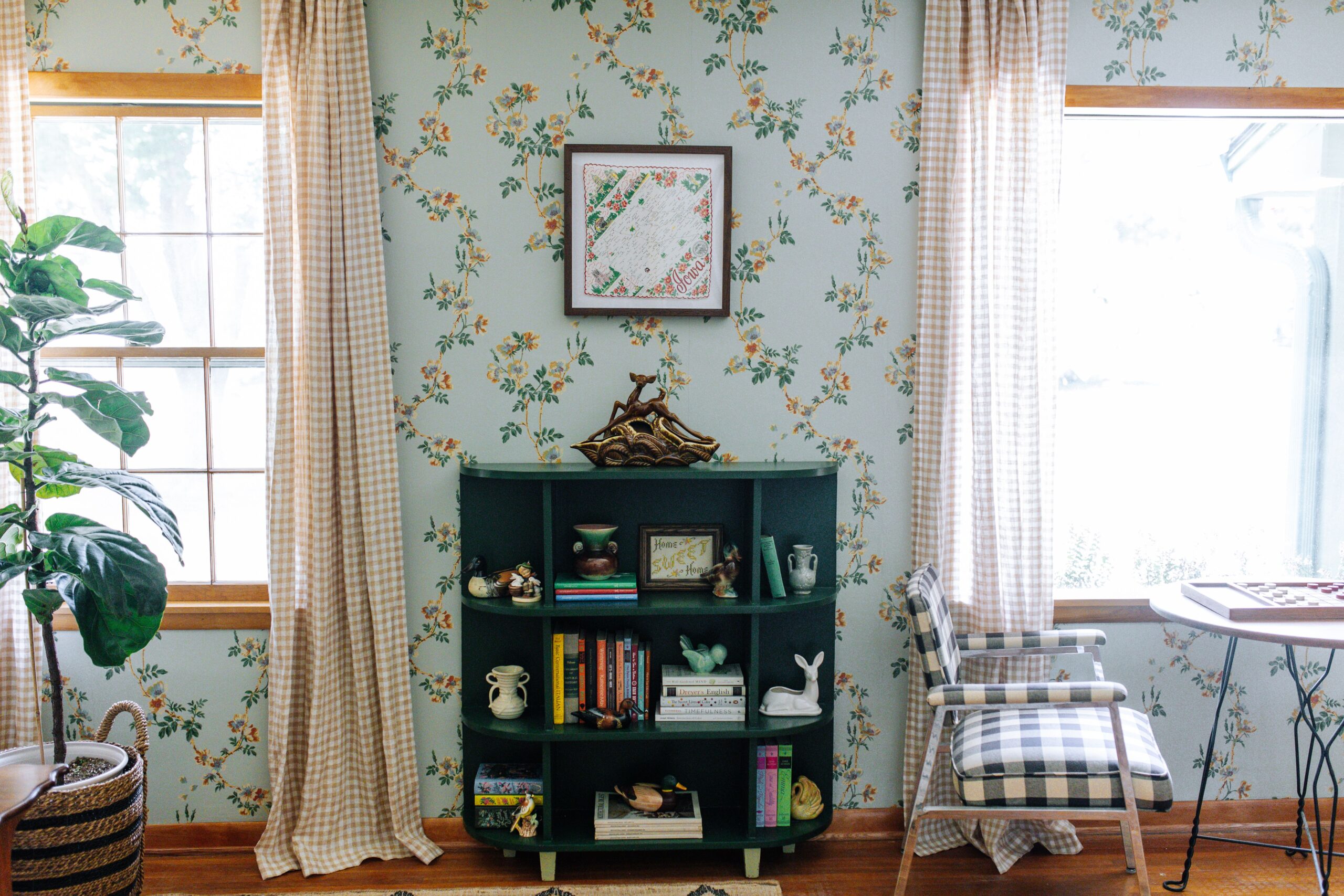
Gingham, checks, florals, fruits, stripes…for anyone reading this who wonders how all of these patterns can work together in the same home or even room, do I have a blog post for you today! So far, in this series, we’ve touched upon general design tips, a guide to mixing vintage and modern furniture, setting a festive tablescape, and crafting a party-worthy game room. Today, we dive deep into how to mix patterns to create a unique and layered look. In my Airbnb vacation home, Foxcroft Estate, I mix prints in nearly every room. Let’s look at a few of the rooms to dissect why it all works cohesively.
Tip #1: Be purposeful about scale.
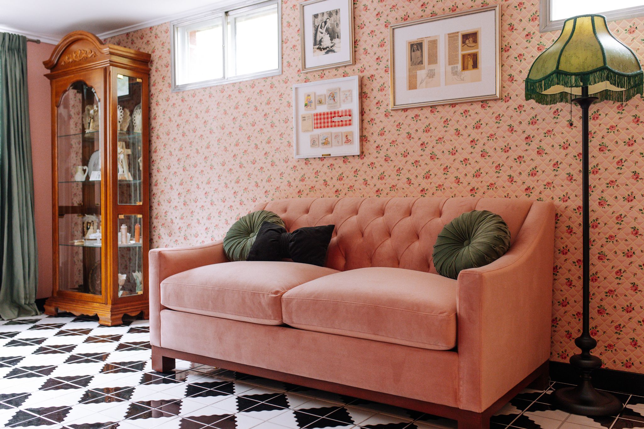
Far and away, this is the most important thing to keep in mind when approaching pattern mixing so you don’t end up with what looks like the inside of a discount fabric bin at the craft store. I first brought this up in my top design tips posts of the Retro Revival series, but I have to reiterate that here again. Pairing two or more small-scale prints in a large application (think floors and walls) can be really overwhelming for the eye. A better, more balanced approach is to vary the scale. In the bridal suite of Foxcroft Estate, everything is harmonious because the black and white checked floor dominates, counterbalanced by the delicate floral wallpaper.