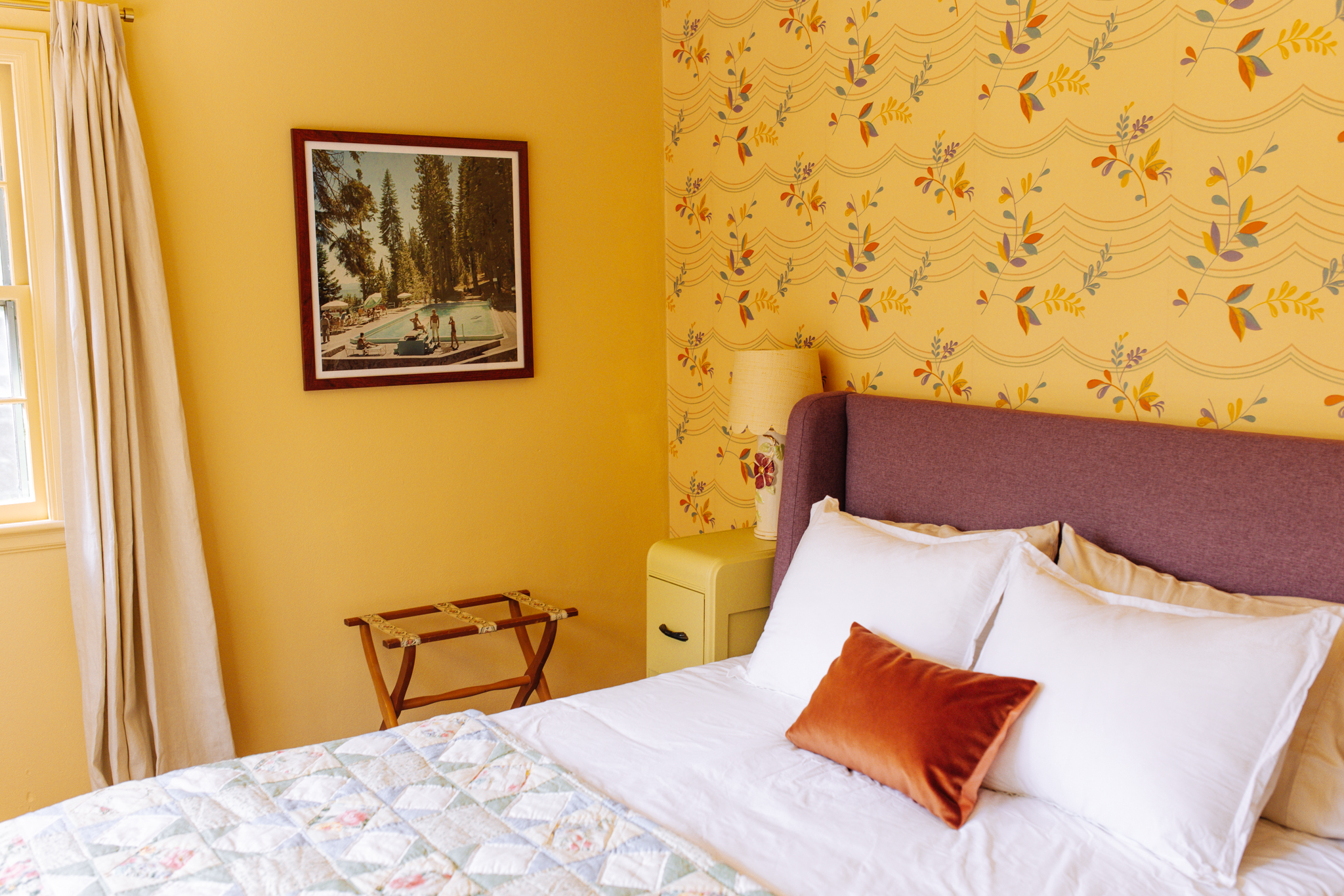
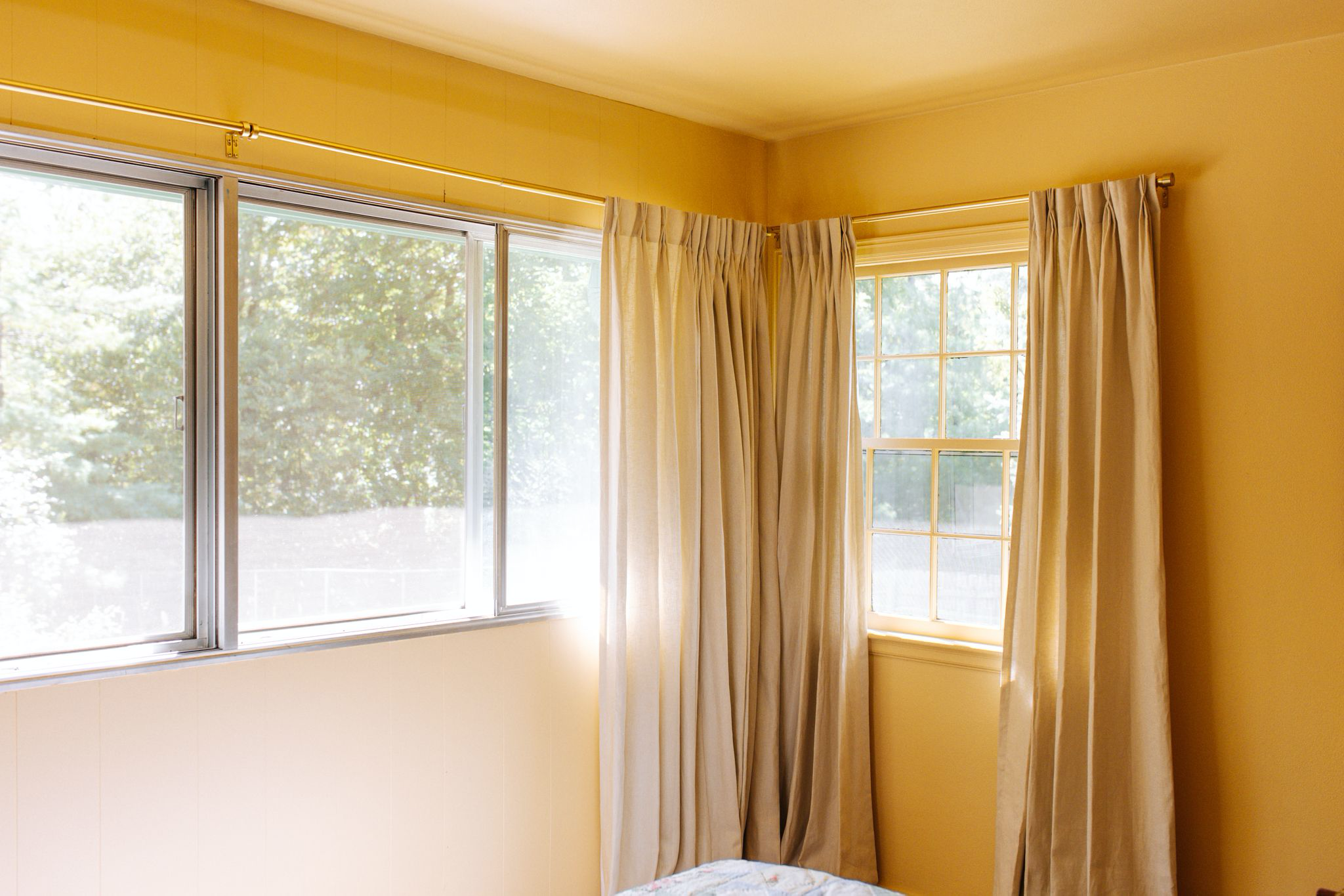
The primary bedroom at Foxcroft Estate is one of the brightest and happiest rooms I’ve ever designed. This bedroom is connected to the primary bathroom so I knew I wanted it to have Deco vibes, but I wanted it to feel more 1930s rather than traditional Art Deco. This room has so much color and pattern but also feels very cohesive. I love that this room has such a great view of the pool and evergreens in the backyard, making it so serene and enchanting year round.
Wallpaper & Paint:
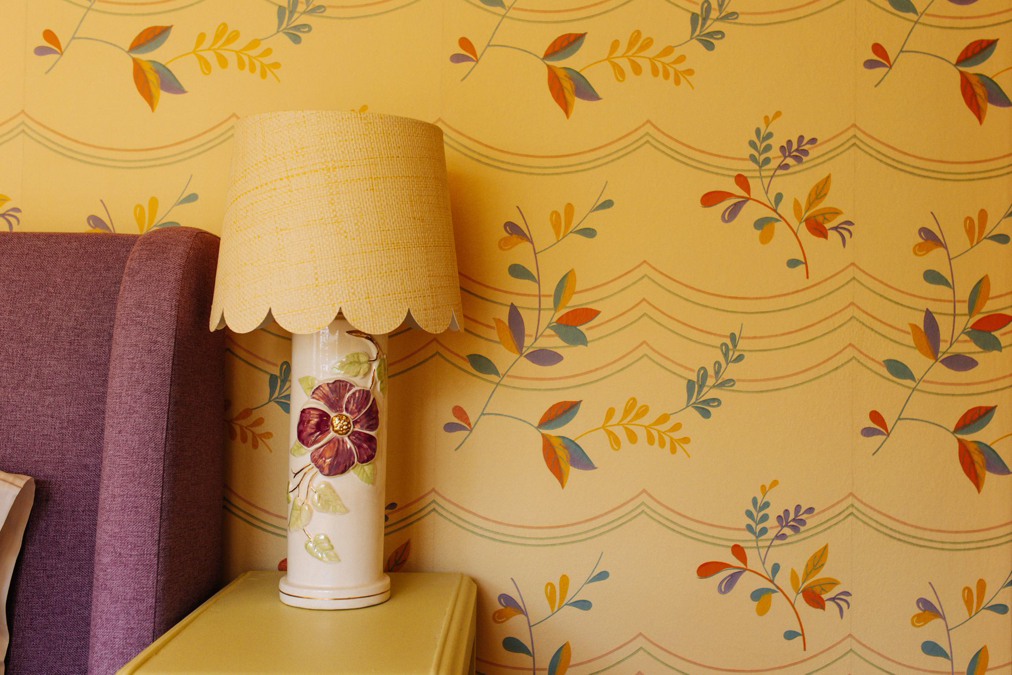
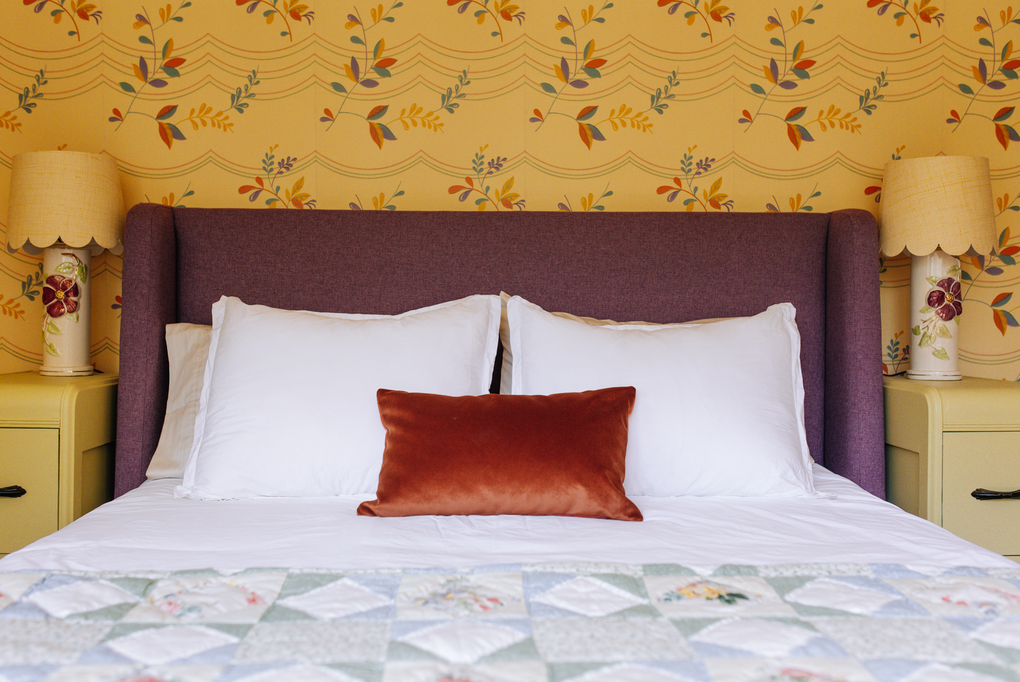
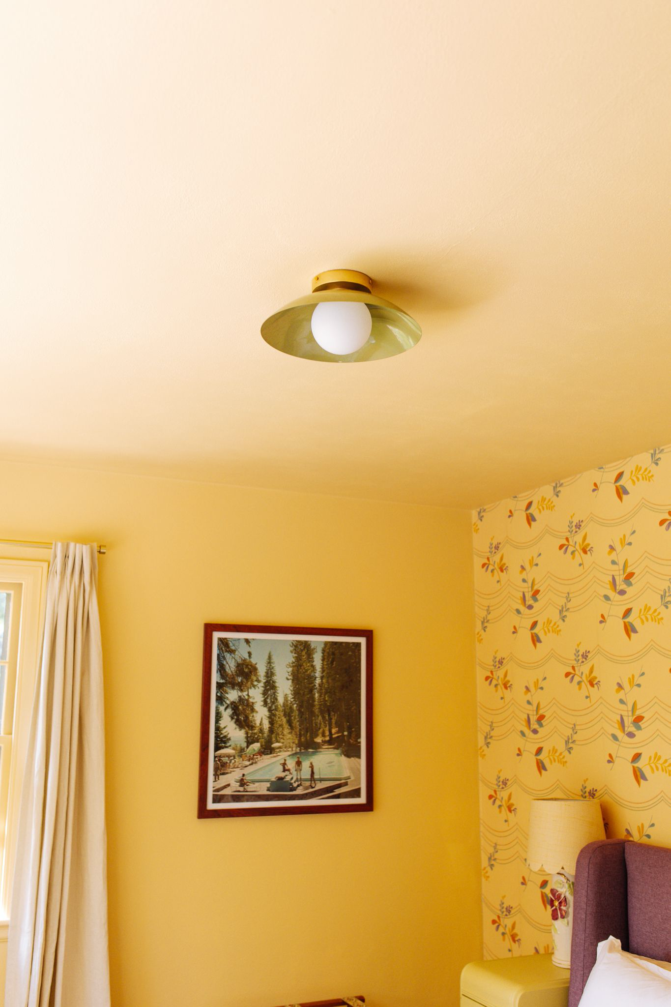
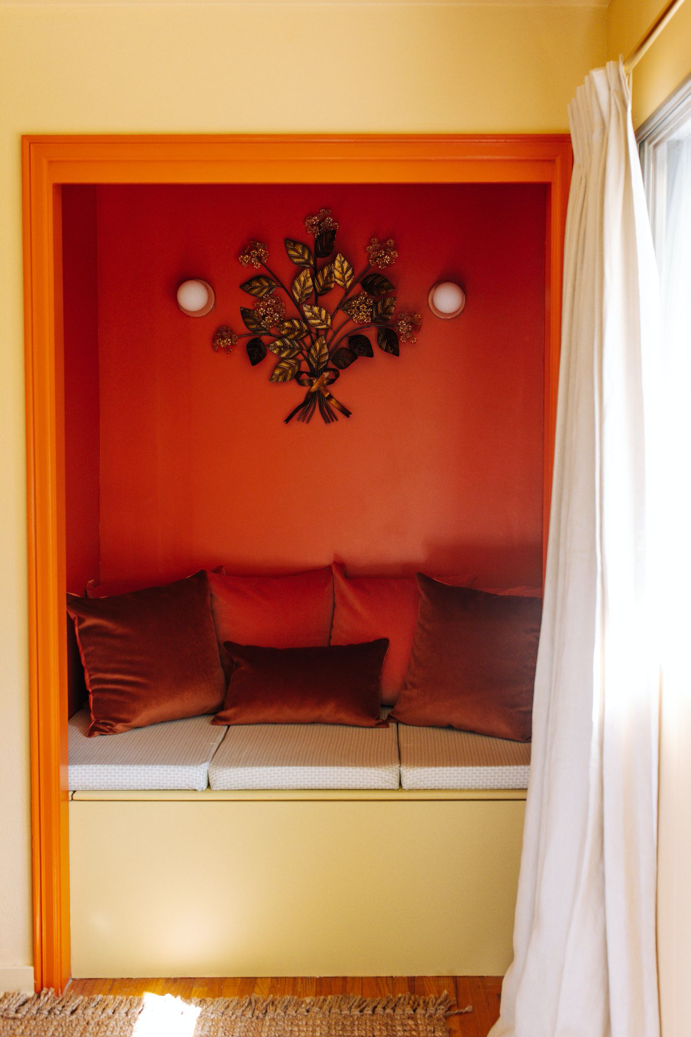
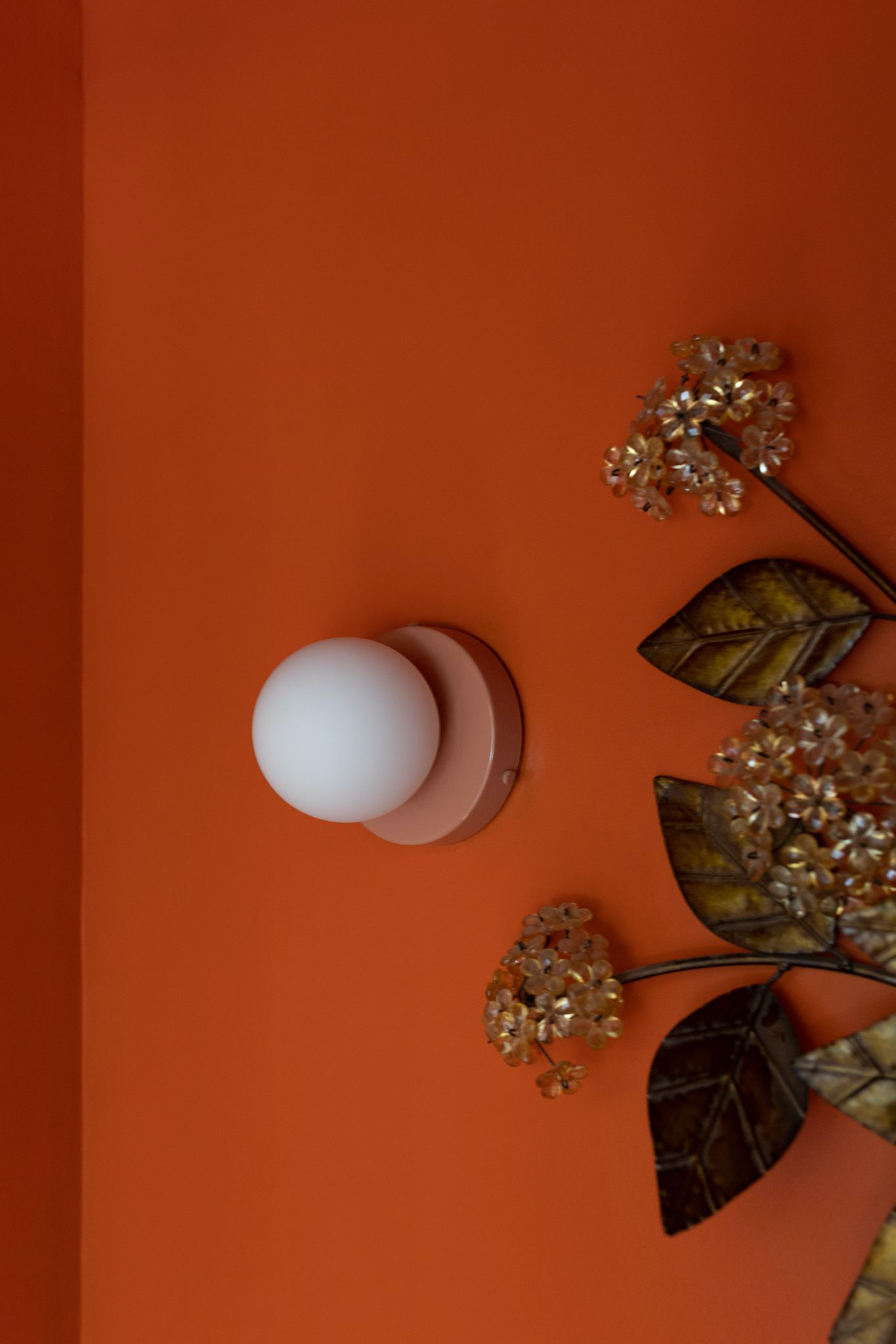
This Bradbury Wallpaper called Fiesta from their 1930s collection is what inspired the rest of the room. It determined the entire color scheme and I used every color in the wallpaper in other places in the room (yellow, pink, green, rust, blue, and purple). I also used the leaf motif and scallop pattern in other places in the room. This is such a fun wallpaper and I’m so happy I found the perfect room to use it in. We did a color match for the yellow in the wallpaper and used that on the walls, trim, and ceiling. The other paints in the room are Farrow and Ball. In the closet turned nook we used a rusty orange color called Charlotte’s Locks and on the bench and side tables we used a green called Churlish Green.
Furniture:
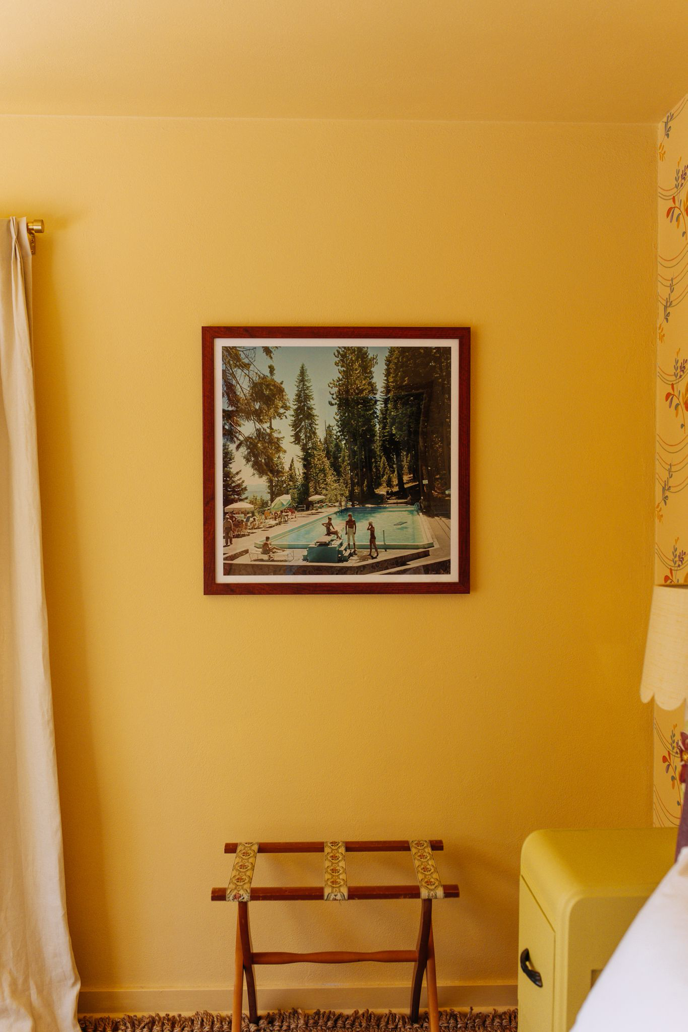
The headboard and bed frame are from Apt 2B. This is their Tatum Upholstered bed in the color Amethyst. I don’t usually love the color purple, but I thought this would be a fun way to incorporate the purple used in the wallpaper and I knew this choice would stretch me creatively. The Art Deco nightstands were a Facebook Marketplace find that we painted and the luggage rack is from a local shop called The Picker Knows.
Bedding and Drapery:
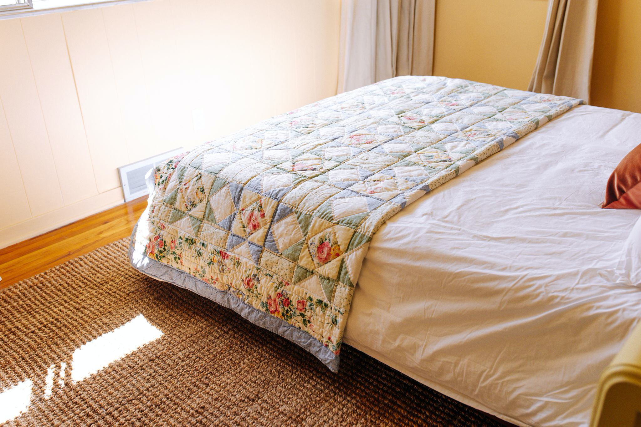
All the bedding in the house is from Under The Canopy. The floral quilt is vintage and was purchased locally. The drapes are custom from an amazing company called The Drape. These drapes feel so luxurious and add a lot of drama when closed, becoming a wall of curtain.
Lighting:
All the lighting in this room (except for the bedside lamps) are from Lightology. These Deco style lights are their Orb Surface Mount lights made from the company, In Common With. For the ceiling we went with a green that compliments the other green used in the room, for the sconces in the nook we went with a peachy pink that matches the wallpaper. The table lamps are vintage with new scalloped shades that mirror the scalloping in the wallpaper.
Decor:
We have two pieces of art in this room. One is a Slim Aarons print called Lake Tahoe. I’ve always loved this photo and felt like it perfectly captures the vibe of our backyard with the pool and evergreens. We also have a Mid-Century leaf sculptural piece between the sconces above the bench in the nook. I wanted to to tie in the leaves on the wallpaper somewhere else in the room and I think this was the perfect choice.