Welcome to Apt2B Presents: Retro Revival, the culmination of a year-long partnership with designer Emily Vallely-Pertzborn who undertook the complete overhaul of her husband’s circa-1940s multi-generational family home in Des Moines, Iowa. Apt2B furniture and decor marries Emily’s bold, eclectic creative energy to resurrect a dated and drap estate. Throughout this series, the designer is bringing us a grab bag of tips, tricks and expert advice for nearly every room of the home.
Hi Apt2B! It’s designer Emily Vallely-Pertzborn again. We last met when I introduced you to Foxcroft Estate, the heirloom home my husband and I renovated for a new generation. Be sure to visit the first post in this series to see all the before and after photos of the project, as well as some awesome vintage images from the house’s past.
Today though, it’s time to dig down into my design expertise to bring you my top five decorating tips you can use to create a beautiful, eclectic yet cohesive home, a.k.a. not “safe” and boring (but pulled together). Stylistic choices in the home, unlike fashion, have permanence, so it’s important to make decisions you won’t be sick of five years later. It’s easier said then done, which is why many people go the neutral route in their design. If you’re looking to translate your personality into rooms with character but aren’t sure how to make it work, you’re in the right place. These are concepts I use for every home I work on, including Foxcroft Estate. Cookie cutter, be gone!
#1: Bring on the color… in threes!
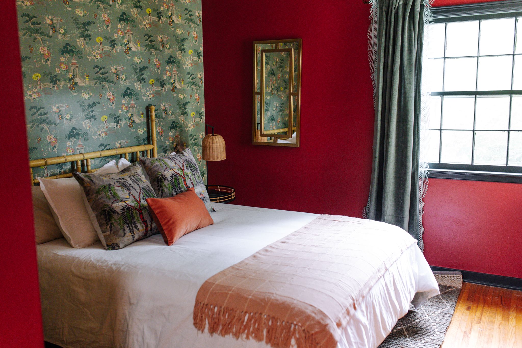
When it comes to interior design, no color should be off limits; it’s all in how you use it. Complementary colors always work, and I use them often. For example, in the Formosa Room at Foxcroft Estate (above), I paired red and green to create a bold, inviting statement. I know what you’re thinking…Christmas much? I used to be very afraid of this duo because of its holiday association, but now they’re my two favorite colors to design with. My favorite trick is to pair them with an additional color (like pink!). Blush, for instance, adds interest as an analogous hue to red and softens things up visually.
This three color rule for the main scheme of a room can work with most combinations. Like I mentioned, starting with two complementary colors (blue and orange, or purple and yellow) as your base is a safe bet. Layering in that additional color is often an intuitive decision for me, but a good trick is to look to an inspiration point, or even your closet. See what you’re drawn to in a rug you like, an art piece, or even a patterned dress or outfit you often put together. I personally have some colors that I come back to time and again. I consider soft pinks to function as neutral, so they work with most color schemes. Just like it works with red and green it could easily work with yellow and aqua. Keep in mind that the room may dictate the intensity of the color you need to balance your palette: A dark, moodier space might need a warmer hue to make it feel cozy and a very bright room might need a cool color to ground it.