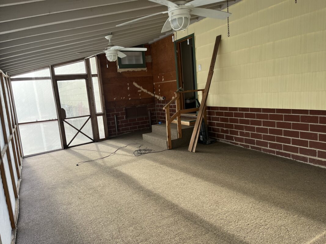
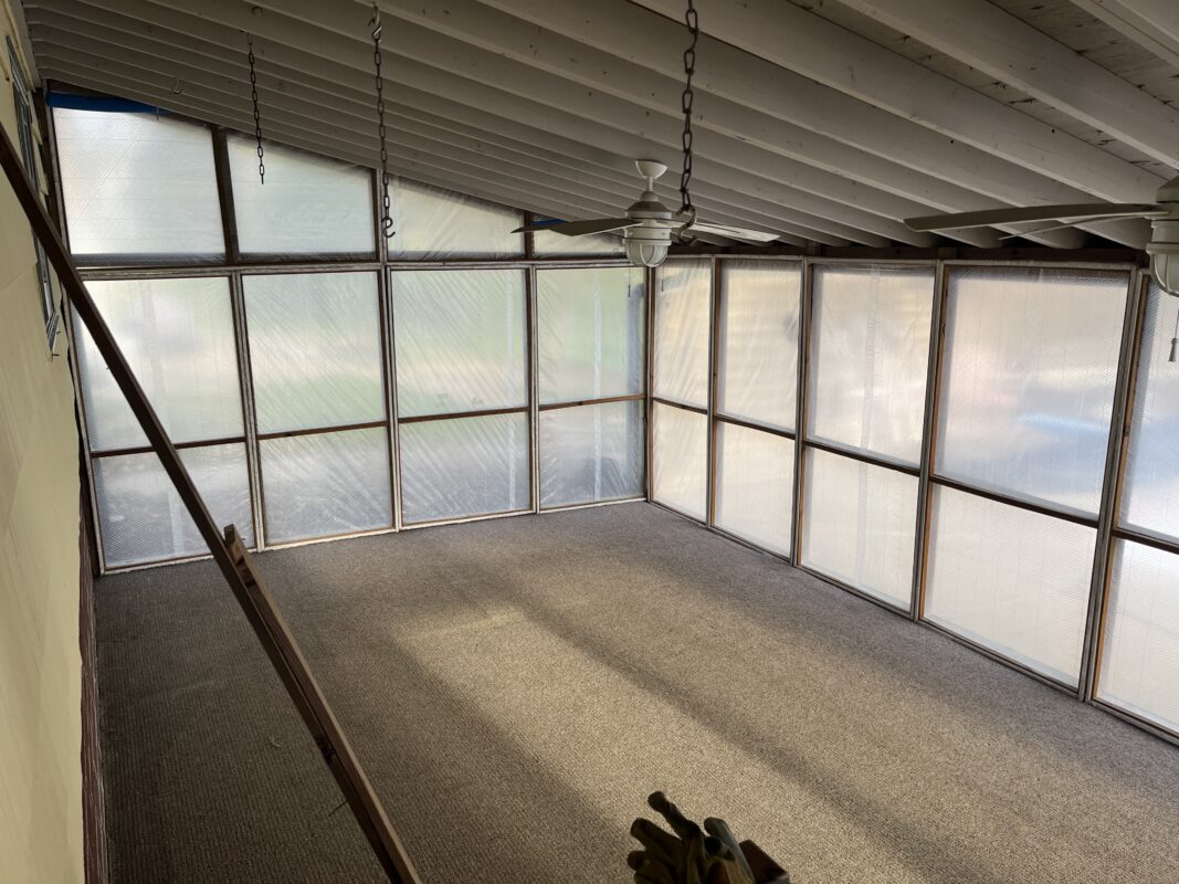
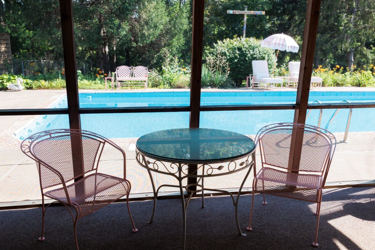
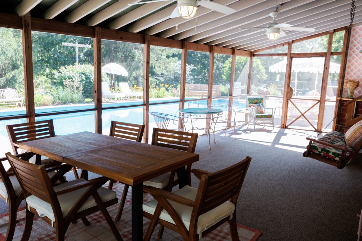
The last major design project that needed to be conquered at Foxcroft Estate was our screened in patio. We finished renovation last September and needed to open up the house to guests before winter, so this project got pushed to this Spring. This screened in patio is one of my favorite places in the house. It is the best place to relax on a Summer day and it just has this magical feeling I can’t quite explain. However, it did need some TLC. We completed this project on a pretty tight budget and went with updates that would make the biggest impact. For example, I originally hated the carpet and wanted it replaced. But once we added the lattice corner, painted the ceiling with green stripes, and updated the furniture and decor, it was no longer such an eyesore to me. A little bit of color can make a huge difference in a space and I think this room is a great example of that.
Updates:
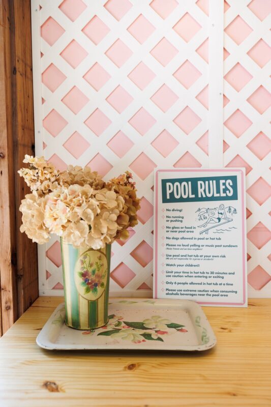
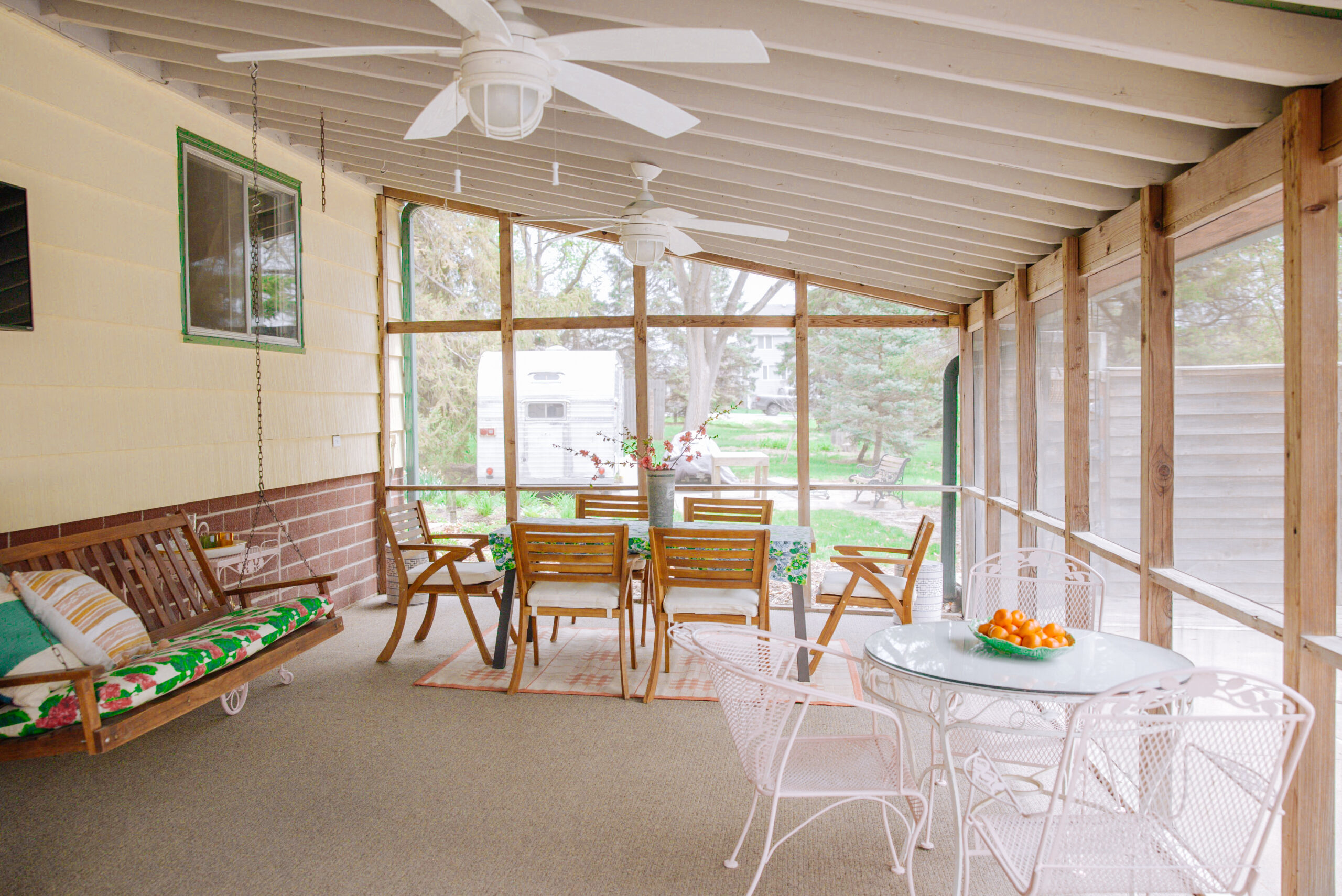
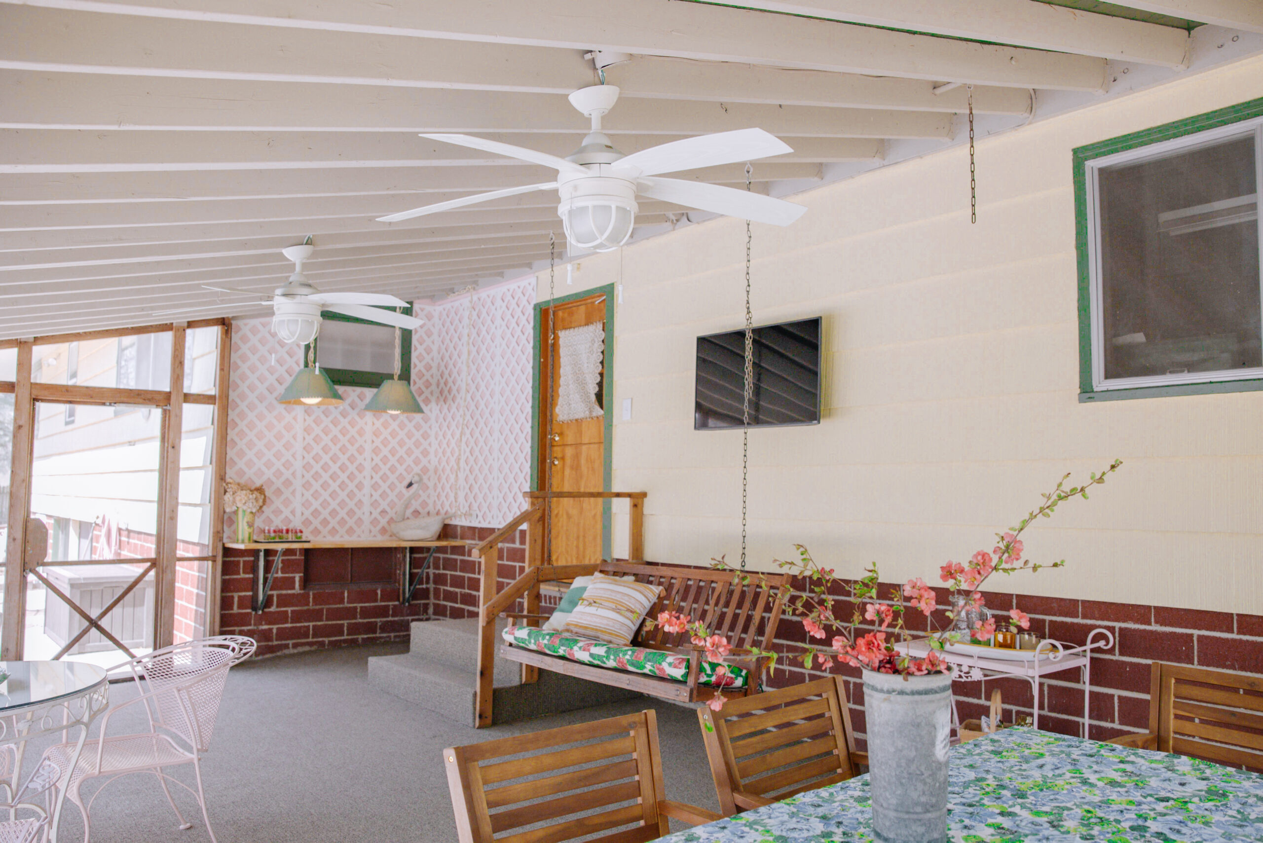
As mentioned, we created a pink and white lattice corner with a built in bar, painted green stripes on the ceiling, added a TV to the wall, and bought new furniture and decor. We spent less than $3,000 on this project.
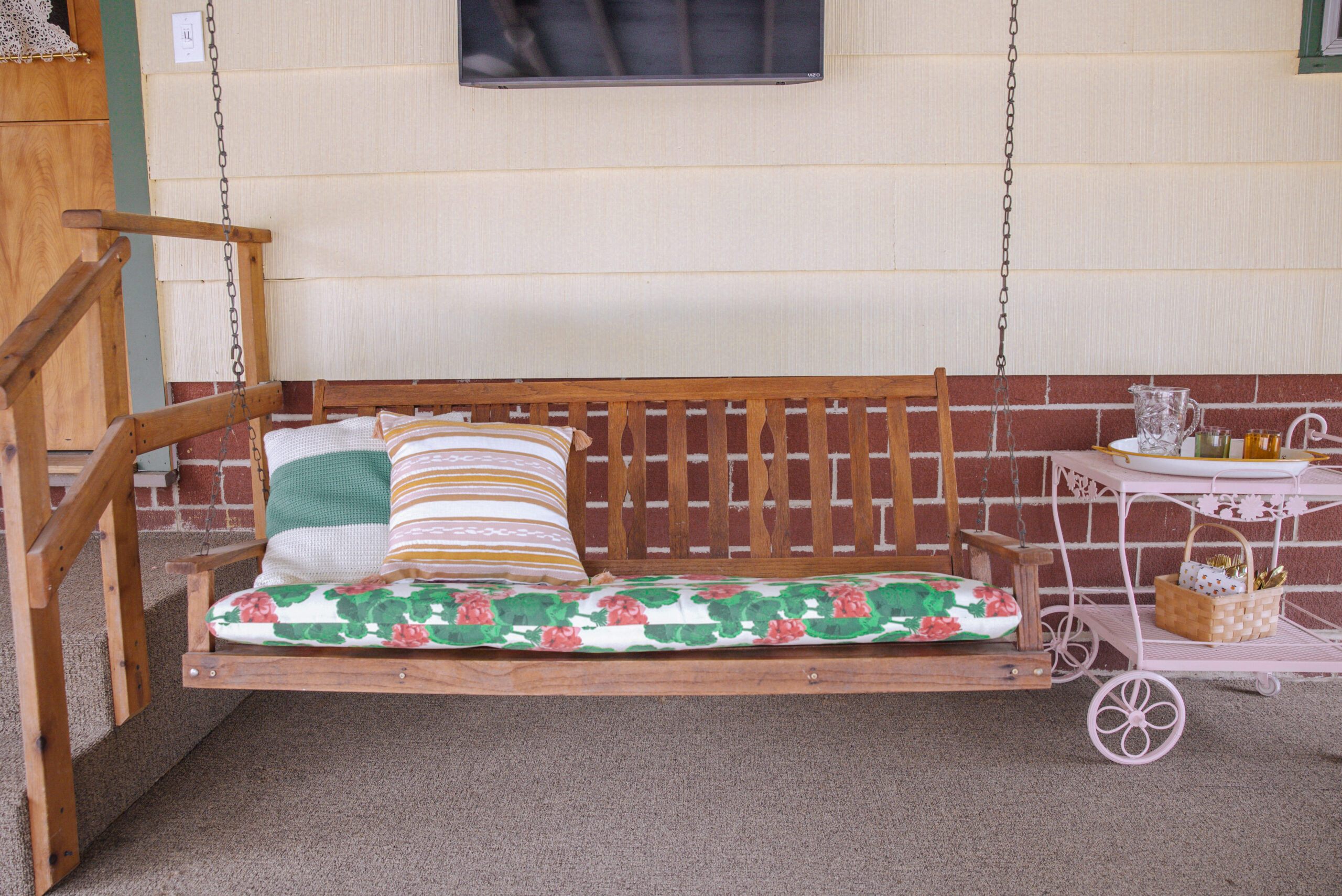
Furniture:
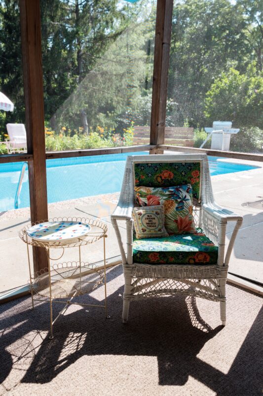
The swinging bench has been in this porch forever. My father-in-law re-stained the wood last year, so I decided to get a dining table that closely matched that stain. This dining set and plaid rug were from Overstock.com. The wicker chair, metal side table, and iron bistro table were purchased locally at antique stores.
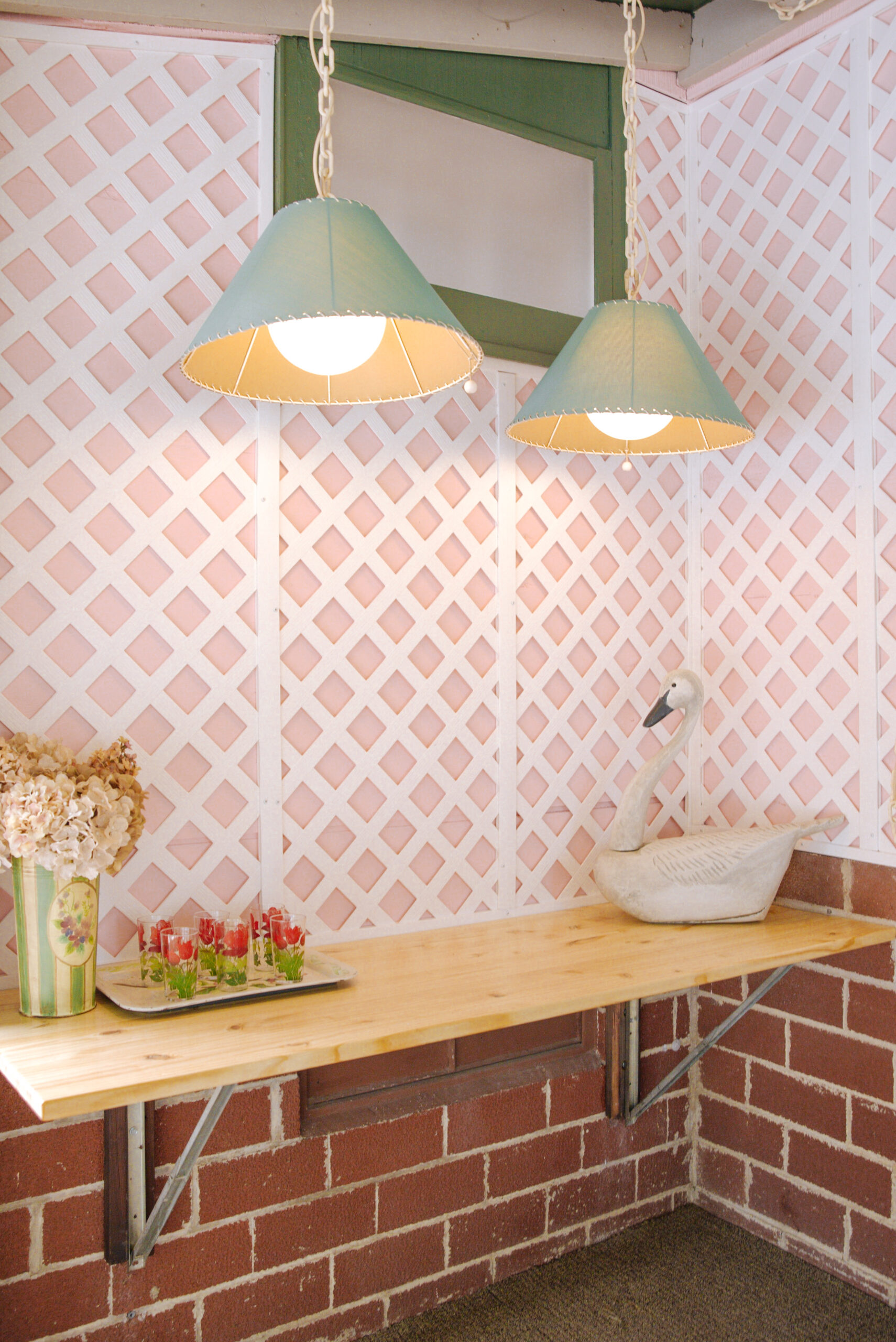
Decor:
The blue lights above the bar were already in the porch and I knew I wanted to utilize them! I love the way they look in front of the pink lattice wall. All of the decor and bits and bobs are vintage or thrifted. We designed this custom pool rules sign and I’m obsessed!

