When I was growing up I remember everyone always hating on wallpaper. “It’s so dated,” “It’s looks like a grandmas’s house,” etc. Well it appears this is a trend that might be here to stay. This makes me so happy not only because it’s a wonderful way to add color and pattern to a room, but despite the notions of wallpaper being dated, used correctly I believe it can be timeless. It was a dream come true to partner with Bradbury Wallpaper on my vacation rental home, Foxcroft Estate. Bradbury reproduces wallpaper from the 19th and 20th centuries, so you can find patterns from any era and style. I am proud to share that I wallpapered the entire house with the assistance of my husband, mom, and mother-in-law. It was so fun to learn this skill and I will be wallpapering all of my future homes for the fraction of a cost (wallpaper installation is not cheap)!
Below are just a few of the Bradbury wallpapers used at Foxcroft Estate. In some rooms I had a general color scheme idea and chose the wallpaper accordingly, but in other rooms I let the wallpaper dictate the color scheme. For a more in depth discussion about color and design tips you can check out this blog post I wrote for Apt2B! I also have a post where I share how to mix patterns.
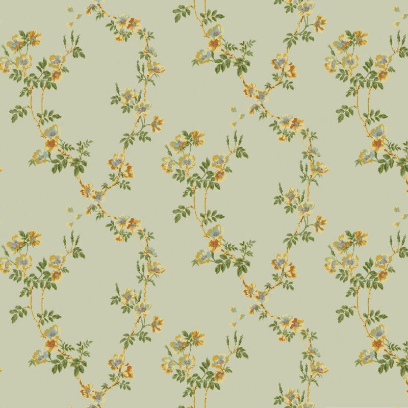
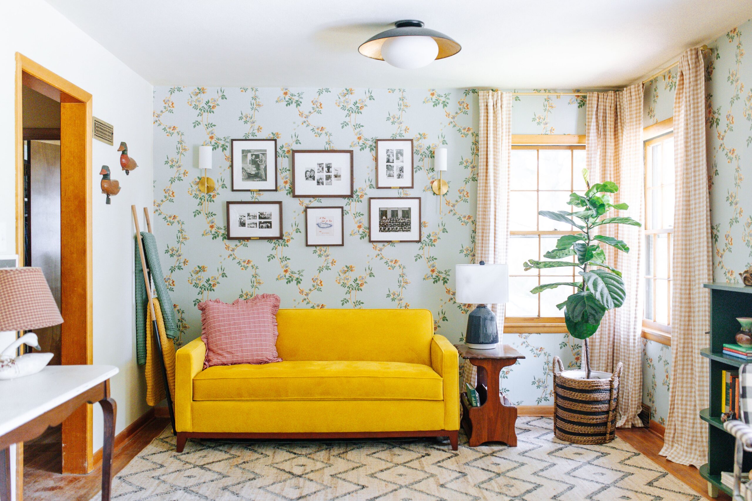
In the formal living room, I went with this timeless floral pattern 2D-107-C in the color Mint from Bradbury’s 1920’s collection. In the great room (living room, kitchen, dining room), I want to combine shades of green, yellow, and red. While this mint has a blue tone, it works great with the general scheme. The dark green leaves on the flowers tie together some of the darker greens within the space. I also pulled inspiration from some of the yellows and creams in the pattern by using Heather Taylor Home cream gingham drapes and this fabulous Apt2B Monroe Drive Apartment Size Sleeper Sofa Bed in the fabric, Marigold Velvet. This room has breathtaking views of our front yard filled with evergreens and walnut trees, so the natural pattern of this wallpaper compliments the country side landscape.
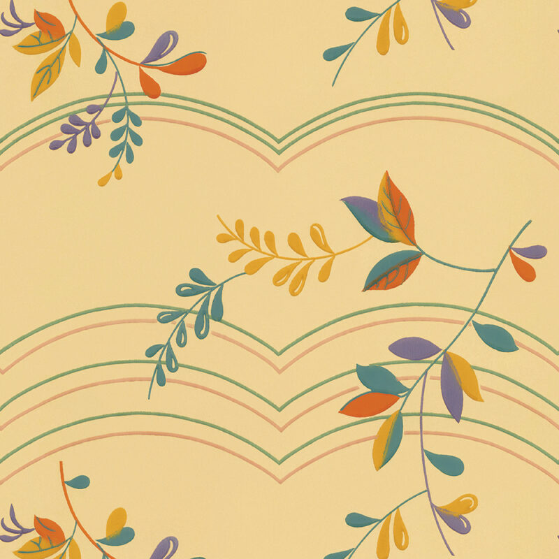
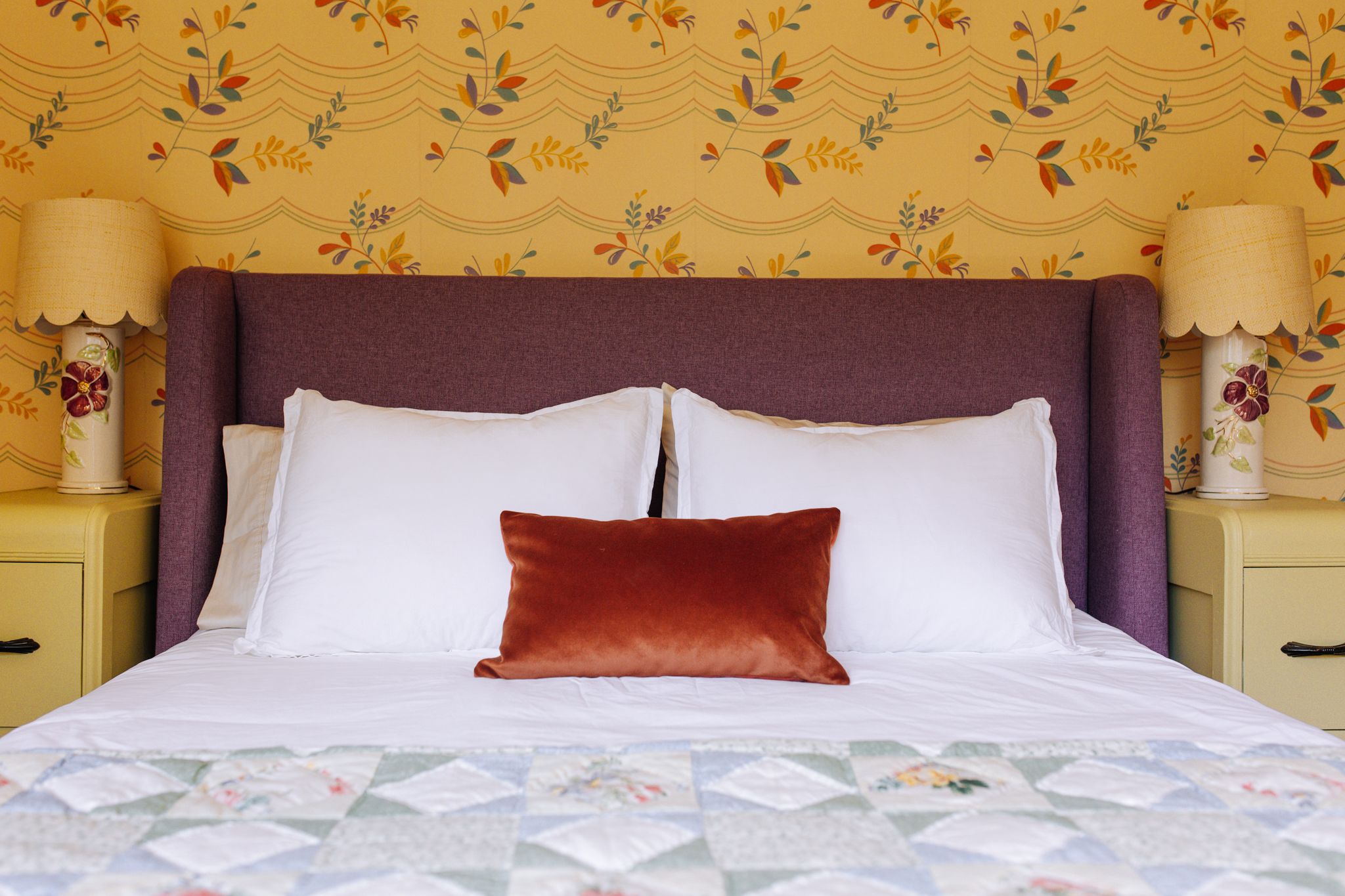
The primary bedroom was extremely fun to design because I decided to use every color within this fabulous 1930’s foliage/scallop print (3D-137). This pattern has seven different colors (buttery yellow, pink, green, purple, blue, rust, and gold). I usually shy away from using purple in both my decor and wardrobe choices, but I decided to do something out of my comfort zone by pairing the wallpaper with Apt2B’s Tatum Upholstered bed in the color, Amethyst.
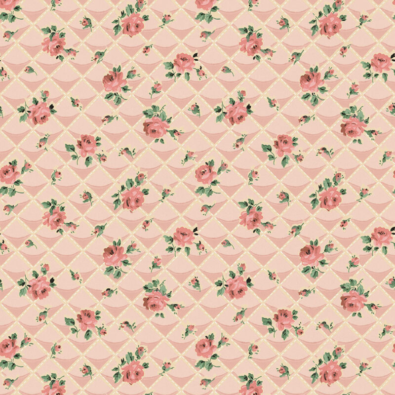
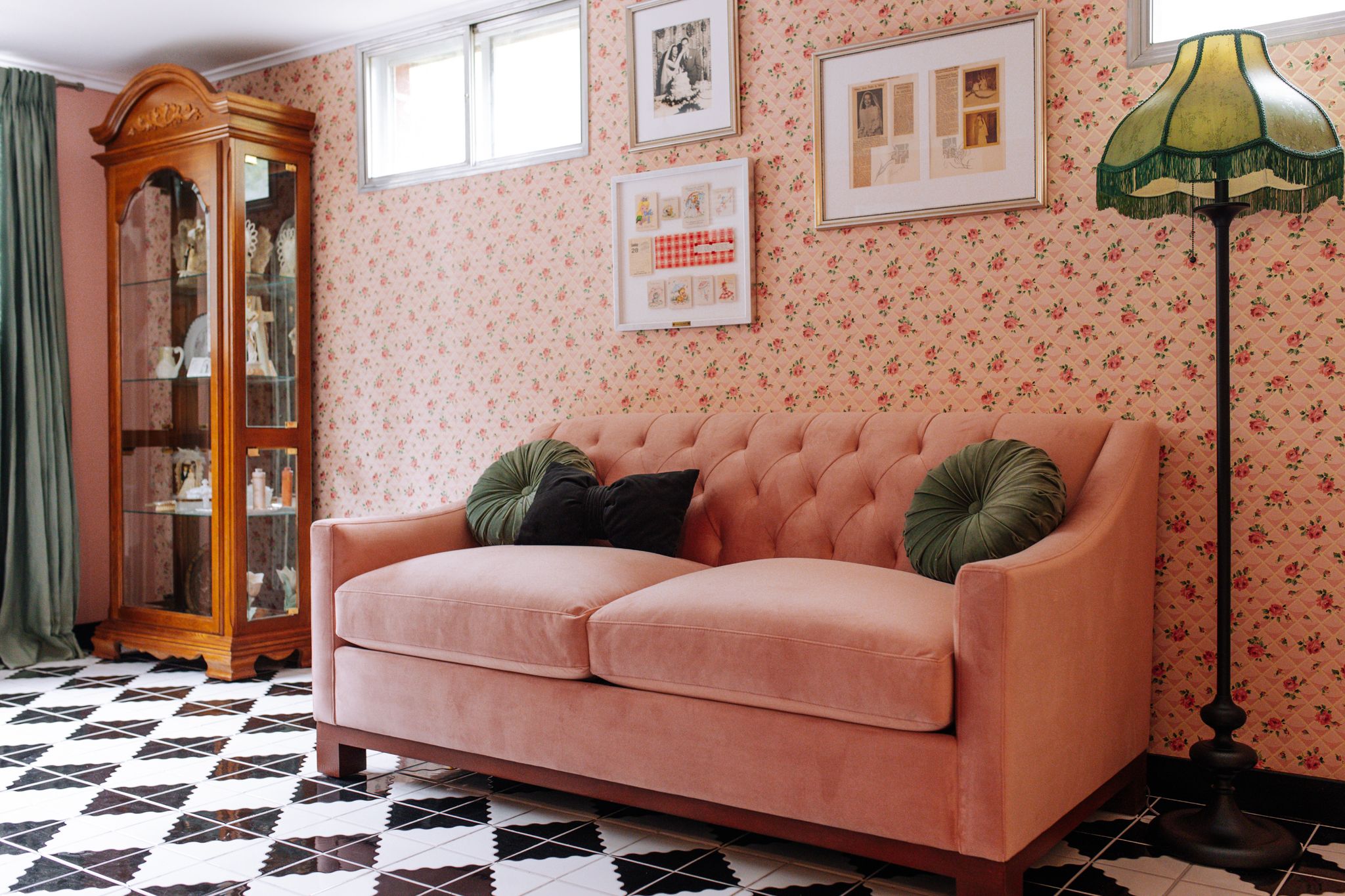
Our bridal suite is fairly simple in color but loud in pattern. I was very inspired by the designs of Dorothy Draper when dreaming up this room and knew I wanted to go with a black, white, and pink color scheme. Once I had a sample of the wallpaper (Bradbury’s 4D-110 from their 1940’s collection), I decided to use green as an accent color. Pink and green is one of my all time favorite color combinations. My bedroom growing up was a dusty pink with green accents, so this color combination is very homey and comforting for me. Rather than go with a green sofa, I decided to lean into the pink by using this Apt2B Pink Velvet Sleeper Sofa.
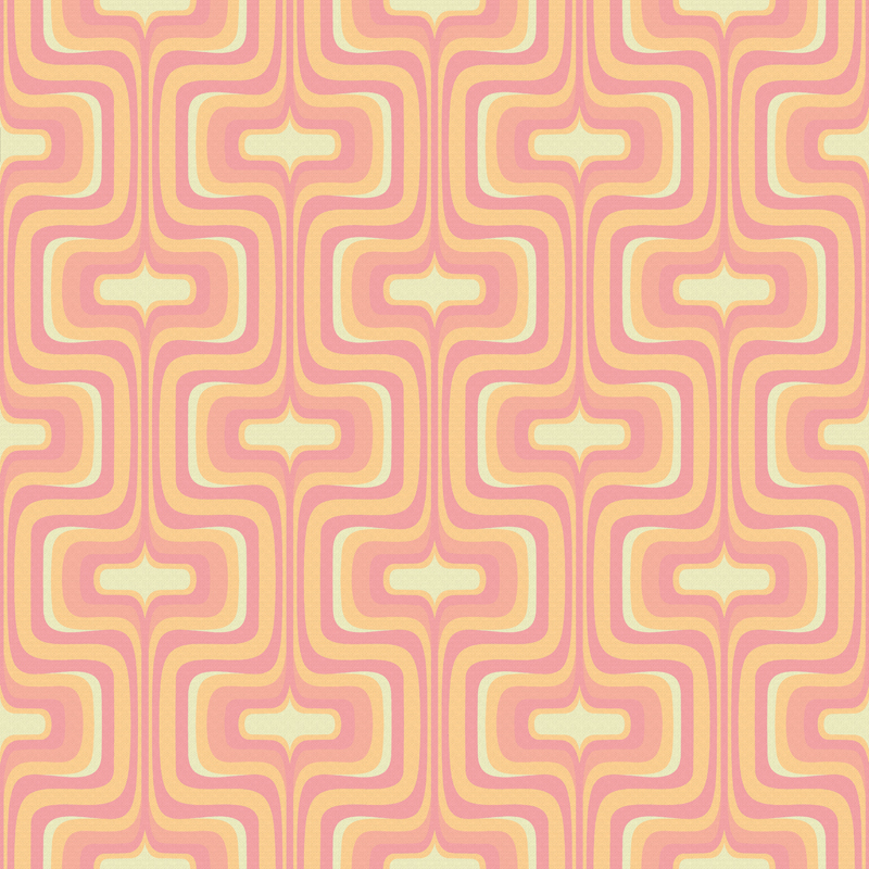
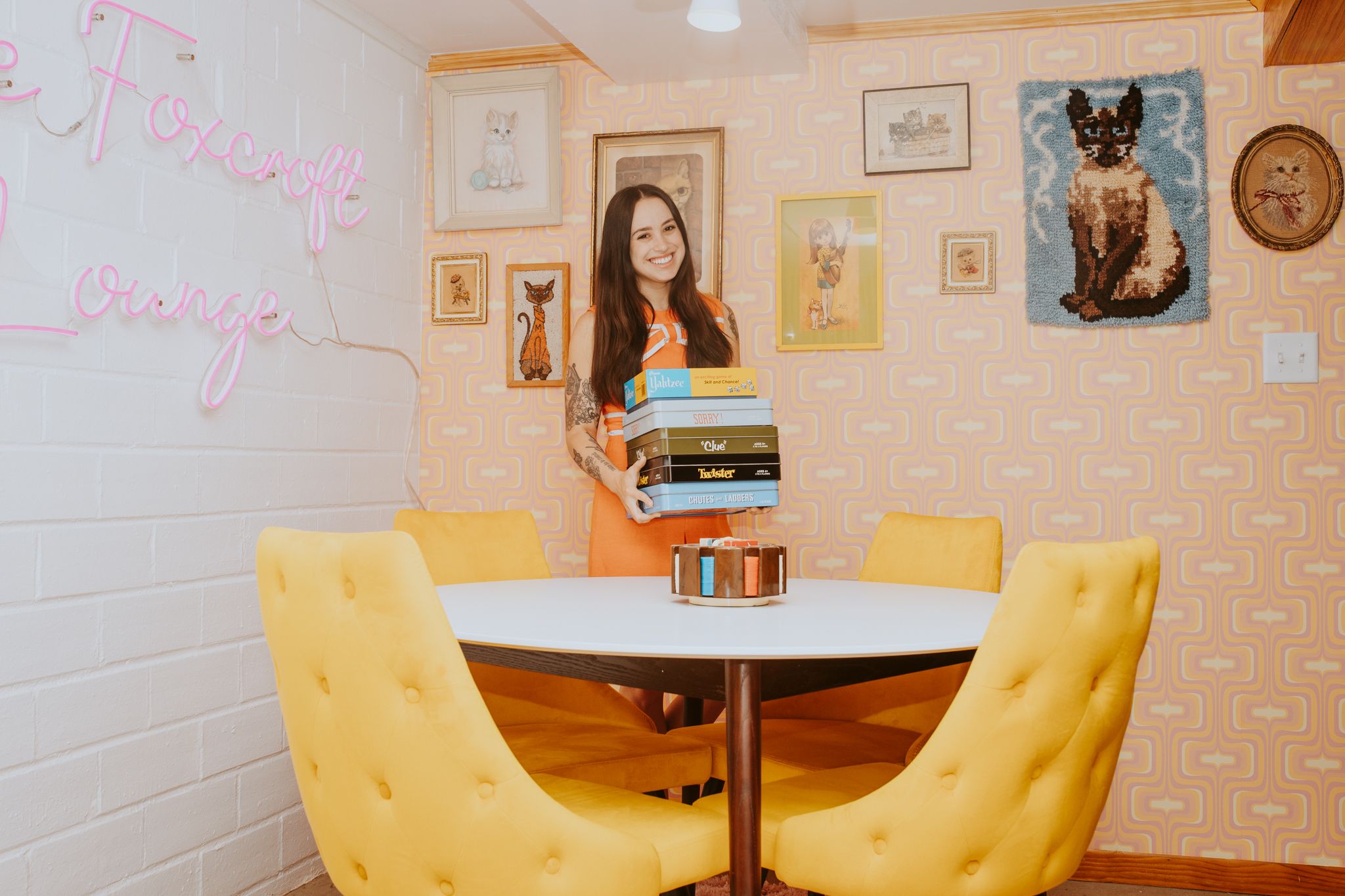
In our 1970s themed game/tv room, I knew I wanted to combine pink, green, yellow, and orange. This was one of the few instances where I searched for a very specific color scheme with Bradbury’s selections. I landed on their Mellotron wallpaper in the color Kooky Coral from their Mod Generation Collection. This room is filled with Apt2B furniture. These Lula Side Chairs in yellow velvet, add a bit of glam and drama to the space.
For more info on my partnership with Apt2B you can check out this comprehensive blog post about our collection, “The Retro Revival.” Also be sure to follow Foxcroft Estate on Instagram and book your stay through Airbnb.

